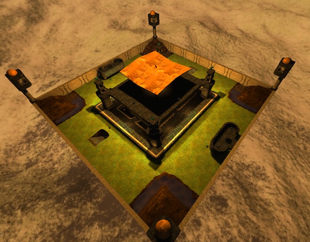
Vamp did say you can copy parts into your own map.. But then, why even do it? The parts you copied added nothing to the map to elevate it to a new level of quality, and of course you didn't acknowledge that you copied the parts.
Symmetry, I agree, is a horrible idea, especially on such a small map. This map is terribly basic, and making each side the same only serves to make that more obvious. On larger, more detailed maps (look at a lot of the CTF maps) this is acceptable, but never should this be in a DM map.
That said, the layout is pretty bad too. You won't see this till you work on more maps (I didn't, at least..) but you need multiple levels, platforms, and various creative ways to get to these levels. And no inexplicable things - first, what indicates that you should fall through the rock in the corners? Second, what is that weird jumppad platform? What is the significance of it?
Some parts are not built with gameplay in mind at all. Think about the spiral staircase - it's extremely easy to fall off of.
You also need to work out a theme. This seems more like a mishmash of artistic ideas thrown together with no unifying concept. Think - anyone playing this map should be able to BELIEVE it's a separate world. With that in mind, I tend to discourage the uniform walls surrounding the map - try to mix it up a bit so it's creative. Maybe try rocks in some parts, or making the walls less "perfect" (straight), ie by putting buildings in the way or something. A map that comes to mind for this example might be duel8 by t-chen.
All said, there are some really cool things in the map. You obviously know your way around a grid ;)
I like that rooftop. But you need to be concerned about the overall impact of the map. Do you want to make a gorgeous, logical map, or a disfunctional collage of artistic elements? Right now you're leaning toward the latter. If you want a functional map (for real game modes) then begin building with that in mind, using large gridsizes, and begin to carve away things for artistic purposes once you have the fundamental layout established. It doesn't hurt to ask for advice in the planning stage either - at this point, where you've already built complex things that took time, the idea of deleting an area for better flow is a really unattractive idea, whereas if you only had to delete a simple block structure for flow, before it was refined, this would be more palatable.
Waypoints are not really important at this stage - most nodes don't even bother with them, and I doubt bots would make the map more interesting to play on anyways. The packaging is somewhat important - you neglected to include a screenshot or a .cfg file (the .cfg does not seem necessary, however). Others stated the proper directory for that whole mess.
As an artistic map, I rate this as 5/10. It looks good but has no unifying theme or logic behind it.
As a functional and artistic map, I rate this as 2/10. It simply cannot function as-is, but it still looks pretty.
