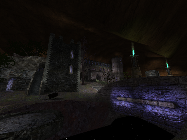
I dont really like the map that much.
The lighting is bad, (never use ambient lights) there are not enough or no light sources in the castles..
the terrain is too angled, especially in the middle.
the geometry is on some places nice, but with your "lightcomposition" it looks boring and undone.. and these rare blue or red spots look not very authentic.
it seems like the map is made in a box,...
there are 4 types of trees.. use only one if possible. and never mix the pink trees with the green ones.. it looks unbelievable
the flora you created is unfitting.
Flow:
there is rarely something like flow.. especially in the underground, you get stuck and you cant even jump.
and the texture set you used in the underground looks again unbelieveable
maybe noclip the bars.
there are noclipped spots outside (under the bridge on the left side of the fort)
where you can see through terrain and see the enemies in the underground.. > bad
The inner of the castle:
there is like no light source and there are ambient lights.
especially the water spot shoked me.. yellow light! with a blue water!, it just wont fit.
when you have the flag you cant just continue jumping.. if you do so.. you jump against a wall.
and if you continue running you land in a fountain. > dead end
the underground tunnel > dead end. it leads to a camping box where you can get killed easily with a rocket (thin walls, no use)
and the player just wont use it, except in a huge massive ctf games with 20 players and up
the big tower:
it seems like you have tons of different ladders?
and the "ladders" in there are again. a matter of taste i guess :S

somewhere in the castle there is a long corridor and you filled it with a huge crate you cant jump on without riflejump
another dead end is where you have the 4 playerstarts
overall i would say there is nice architecture but what is the best architecture when its bad lit..
also you get stuck at many places. even when its an interesting layout. but with many places without purpose. like dead ends.. etc
