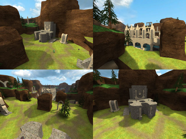
Pretty good.
The layout is more or less perfect, I think.. You've designed it almost formulaicly; the long path in the middle is logically cut off with a small wall, and there's a perfect little sniper spot at the side with the weird structure with curvy bars in it.
Layout aside, I do have a couple problems with this map. First, you've made really short rocky sides, which is fine, but then they're clipped off. Since they should be so easy to jump onto right now, this is a problem.. It really disrupts the illusion in the game. Maybe consider raising those rock pillars too.
The crate texture is really bad. I've never been a fan of it: the resolution is far too low on it, and its colors and details look really fake on it. I'd opt for a different one. Plus it blends almost, with the pink-ish ground underneath it.
Texture blending is immaculate. There is a gradual transition from the grass to the pathways, etc. It was well done.
Small detail: Since you've defined each side with either an x or an o, why not continue this theme? For example, make the jumppad on the x side an x rather than the o you use elsewhere. You can go a step further with the architecture too, but that is your choice.. Right now, I don't see much to define each side; there are no lights, colors, or abstract architecture on each side. But you did make the outside architecture different, oddly.
The wood pillars underground need to be noclipped. They're easy to bump into, especially the metal decals you put on them.
At this point I'm picking on random details since this is a pretty good map. The other thing is you screwed up on the packaging and screenshot.
Anyways, 4/5. This is pretty good, and I see it being similar in gameplay to l_ctf or capture_night: small but intense.
