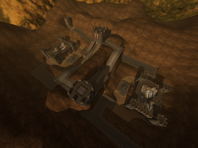
You've actually gone and made the detailing more intense since the last version of this, Obidos. Since the map is quite a bit larger that complicates things. I'm not sure how to count the triangles, but definitely a ton are used on arguably useless details that few will notice. They'll likely notice more the lost performance from such an intense map :P
This map seems a bit too big now. It's just that at certain parts it feels like it takes forever to get somewhere. Those large paths are the prime example. It takes forever to climb the hills, with nothing in the way of cover except those tiny blocks. Then you have that tower in the corner that serves no purpose, prove me wrong. It's a camping spot but looks more important than it actually is.
The rocky cliffs add much more to this, and I'm happy you got rid of the fog lol. But then, the entire atmosphere is different from Obidos. Ultimately I consider this an update of that map considering the fundamental details of it were copied/updated. This version is much more true to your other recent works, which all seem to occur in the desert sun.
Basically, you need more things to provide cover and interesting details. It's a little monotonous. The Great Wall of China comes to mind - practically endless, with little variation in it.
Plus more colors would add something. It's a bit too brown right now. I'm thinking green grass on the ground, blended in certain areas with the brown (similar to shipwreck or fc4).
Anyways, nice map. I like this more. It seems a bit too big and open, like Hallo... or Flagstone perhaps.
4/5
