Problems:
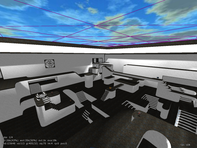
* The textures are prone to blending together when viewed from certain spots. With only 2 basic textures, and rather bland lighting, some areas loose a sense of depth. Better, more directional lighting and slight changes to texturing could fix most of these cases.
* There are a few areas on the map that are just too narrow or too small for quick navigation. This is not a problem for the majority of the map's paths, but it really interrupts the flow of gameplay.
* On the sides of some of the ramps/stairs, there seems to be a texture problem. I understood what you were tying to do there and why it is somewhat difficult, but those areas just look bad.
*That one area of clip on the map was really annoying to me, either fix the area geometrically or change the clip. Clip and noclip also needs to be applied to a few other areas in the map and I would get rid of the glass.
* This is more of a personal taste issue, but I felt that the map's visual style sat uncomfortably on line between stylization and poor execution. The black and white theme could be very interesting if executed well, but inconsistent texturing and a lack of focus really held the map back. The white/grey noise that resulted from the bump map and texture was not good looking and I felt the map would have been stronger with solid textures, although this just amplifies the problem from my first point. The texturing of the map at first glance seemed to follow a pattern, but the more I looked at it, the more I saw its numerous inconstancies. Some stairs and ramps are outlined on the side or in the front while others are not, sometimes the wall is highlighted at the very bottom while other times it is not. These, and other such inconsistencies, took away from the map's visual flow. The geometry also had some issues with consistency, with a few very detailed and ornate areas while the rest of the map is rather bland geometrically.
