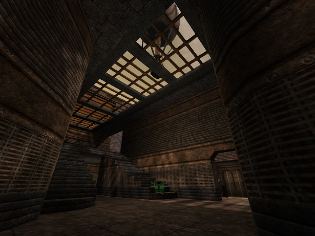
I'll agree with MeatROme. The detailing is great. This, alongside Myst, shows development of an interesting theme. I see them as having a similar one of 1800's exploration technology. Simple gears, fences, brown architecture, and things like the hot air balloon and railroad tracks develop this. I also really like this jumppad. It's a refreshing change from people (like me... heh) making an intricate or simple design on the ground; yours actually looks like it has mechanical parts that push the player upward. That and it's pretty.
You've done a lot here since the last release of this map in terms of aesthetics so that it really looks like a whole new map. However, the layout still misses the mark. It's still really small, rather one-sided, and cramped in feel. With this you could have definitely expanded the map and gave it better atmosphere than a scarcely improved wall surrounding the extremities. The hot air balloon, while attractive, doesn't really fit here unless you open it up and show that it's in, say, a canyon, rather than a box.
Aesthetics are 5. Playability is 2. Average is 3.5 BUT I can't give you 4 ;) Playability's still more important than aesthetics.
3/5 and by the way, you've inspired me to make something of similar theme. Keep your eyes open :)
