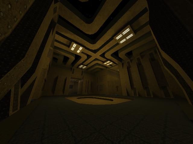
ok ... about your update... u need to re texture the map ... i think that a darker map would be better ... cuz of the openness of the map ... it would make it less ovbious that you are repeating your textures...
some of the textures you use make no sense ... for example .... the pipe/wire texture u use by the jump pad is way to repetitive you need not to have wire/pipes hanging all the way down the map ... the the gets so fricking annoying
some of the time there are 1/2 textures.. u need to render the full texture if you are going to render any off it ... seeing half of a texture makes the texture look out of place and like there should be something there but there isnt
the lay out of the map is very good... u may want to tighten in the walls a little .. it may be a lil to open ...
the map needs more detail ... this can be solve 1 of 2 ways first of which is to bring in the walls a lil ... if you do this the map is smaller and there for look less flat and life less... for example ... metl4... it has a lot of the same details on the walls as yours but because it is tighter it looks complete ... you could also add in some details on the floor .. such as boxes or suports ... or watever... basicly it is to empty .. fill it up...
btw ... im not a fan of the arrows... i no the jump pad is going up ... wat do u think its suppose to go down
also ... add some ledges and stuff ... fill up the map... u can add ledges that u can only rifle or trick jump to ... or that u have to use boxes or some thing .. u need some stuff for those GOD DAMN campers .. and snipers...
IN COMPLETE SUMMARY FILL THE GOD BLESSED MAP UP
chasester
