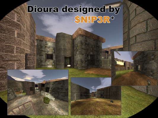
I did not have the time to write a comment about Sniper's map when I gave my rating (and never got back to looking at the thread or this map again), didn't realize it would be such a big deal.
My rating is based off lighting, layout, use of textures, and the custom goal mapmodel that was used. The lighting doesn't seem to fit the "houses" theme that you were going for, same for the wall textures (Neib's textures are nice, I just don't think they fit this map's theme well.) The layout lacks in a few areas, especially in this one area where two buildings almost meet, there is very little room to move around there, so I would suggest maybe making one of those buildings not quite as big as to open that area up a bit for maneuvering. The goal mapmodel is nice, but as Mr.Floppy already pointed out on this maps thread on the AC forums, the mapmodel is simply constructed wrong, and it's appearance is quite odd in-game. It's not that bad of a map, but I've seen much better from Sniper. So there you have it, my explanation.
Also...
"And thanks Bukz for 2 stars without saying why :/"
You have done the same thing to me on my maps, so please don't try playing the victim here. ;)
