To add to Meister's comments, this node has a LOT of problems...
First off, the packaging should be packages/base/.ogz,.cfg,.jpg rather than what you've done.
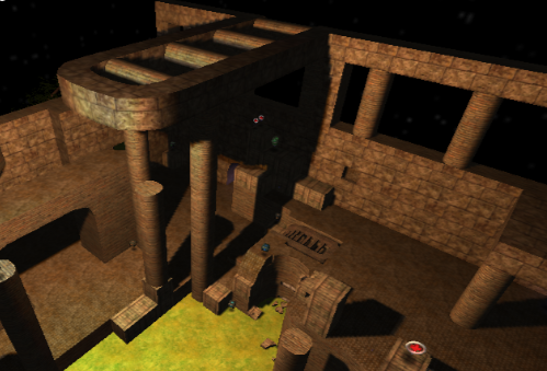
Why is there clipping on the pillars? They aren't obtrusive so the clip actually makes them worse. Also you have clip on this platform on the top of the map for no reason; it's possible to get on the top so the clip is just an invisible wall.
The walls surrounding the map are too short since you can get to the top so easily. I've noticed this with a few of your maps now: You put walls around them. That's really boring and generic. If you look at some maps out there praised for their atmosphere, they bother to put mountains or buildings around the edges rather than a uniform wall to make it look more realistic. You do it to a small extent with that hole in the wall with the tree and lamppost, but that only raises more questions, like.. Why am I not able to get there? Why is there a pathway leading into what is obviously not a doorway? Why does the path go into the edge of the map and into nothingness? That's the other thing.. You need to put effort forward to conceal the edges of the map.
A few other things: Why is there a pillar on the crate? That makes no sense. And you should change the texture on the jumppad so it's not the crate one..
And remove that jungle-gym staircase thing.. It makes no sense.. It's like you're throwing random ideas into the map and hoping they fit.
And remove the mapmodel rooftop and make your own. The texturing on the mapmodel doesn't fit the rest of the map, at least with the lighting you've done.
While on the topic of lighting, why do you have a nighttime skybox but a daytime lighting scheme? It looks weird.
Overall the map is also a little small and cramped with random things in the way. I'd say 1/5.
