Tenyo | 2009-08-17 17:08
Iridium by Tenyo - Version 2.0
Cube 2 (Sauerbraten) | Release | Work in Progress | Singleplayer | Deathmatch | Medium (5-8) | GNU GPL v3
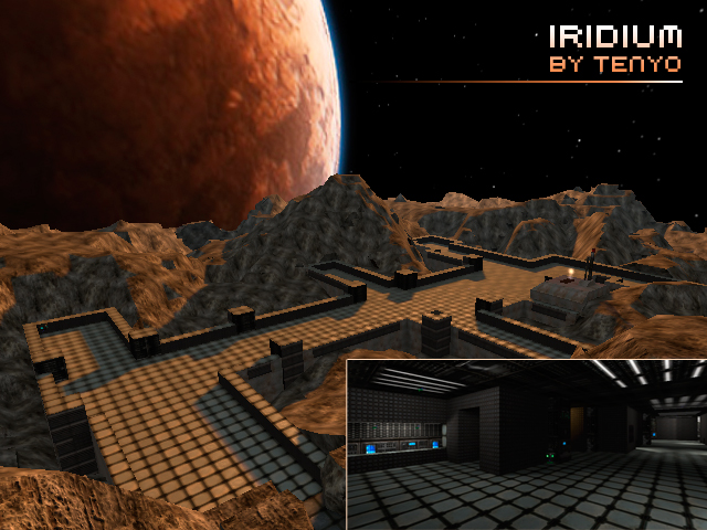
A small indoor/outdoor map suitable for Singleplayer and Deathmatch.
Set on in a small mining base on a distant, rocky moon. The indoor section of the map is set inside the base. Players have access to the outdoor section through a portal and hidden underground entrance. Rocky, uneven terrain - good for ambush and cover attacks. Indoor section has tight corridor setions and rooms which provide a good balance to the open outdoor sections. Ammo and health are scattered across the map to encourage players to explore the map more.
This release should have fixed issues with the terrain height mapping, better waypoints for the bots and a few added architectural elements.
iridium.zip (1.97 MB)
login to post comments
