Falco | 2009-08-14 17:57
Spaceship
Cube 2 (Sauerbraten) | Release | Final Release | Deathmatch | Capture | CTF | Medium (5-8) | Other License
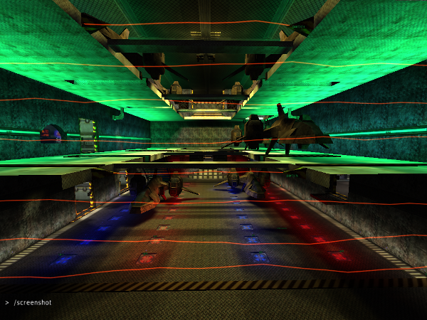
Spaceship: A spaceshipmap with musik and a soundfile.
A spaceship from inside, music and alertsound. It contains a hanger, a commandroom, a briefing room, a cargoroom, a weaponsroom, a canteen with a citchen and a foodstorage, a reactor, engines with fuel, a training room with a simulator and a bathroom.
Good for all modes.
spaceship.zip (3.94 MB)
login to post comments
