Jellymouth | 2009-08-12 23:33
HOV
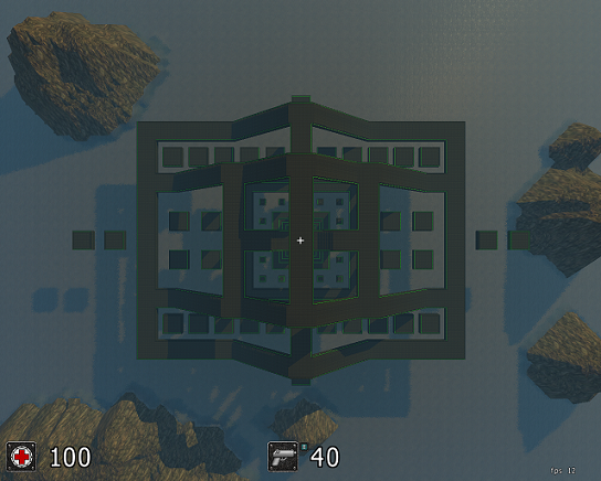
A map with an experimental design for all game modes
Basically, I'm creating this map to see what people think of a layout like this. Huge, spaced-out, and simple. I think that maps like this will provide a large enough area to contain sauerbraten's fast-paced style of game-play, but I would like to see what the mapping community thinks.
This is only a test map. I don't expect it to be in the release, but if people like the idea of this map, I'll upgrade it with more detail and maybe a few obstacles, then I'll re-submit it.
hov.zip (3.11 MB)
login to post comments
