Refer to the Packaging Guide for information on how to fix this.
it my first map ive put on internet
towity
it a free for all map enjoy :D
PePsILiGhT over and out
please read the packaging guide
the file needed to be zipped and the jpg in lowercase (so towity.jpg not .JPG) also put the files in packages/base
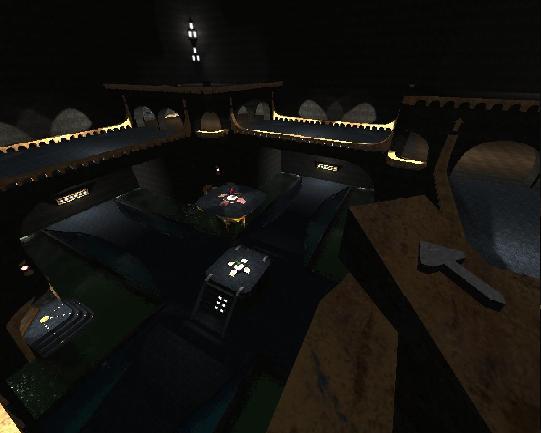
avoid making a map in a box.. use more then mainly 2 tex more lights some jumppads are placed weird (like on the banister) also there are only a few weapons and on only 1 place each building. spread them out so you have everyone a chance to play also think about flow.. gameplay.. the map provides not many tactical movement and is way too symetrical
if you fix these i give you a 3 out of 5
well the title of this comment practically tell u. dont know how to package it my first map ive put on quadropolis so i just put it like it was sorry
(thanks for the guide and for the vote)
the map is incomplete i didnt mension it be for sorry
____________________________________________________________________________________________
nice map,
the detailing and lightning arent bad, but the gameplay isnt very well (for with mode is this map actualy made :P? add it into ur content).
maybe u should change the combination about water above glass, it looks pretty confusing.
anyways nice map, improve those points, ill give 49 points for now!