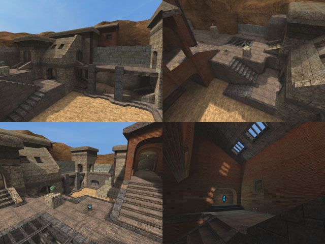
I would disagree. While it's not packed with details, the theme is buildings. Putting much more into this map would overload it. One place where detail wasn't necessary and in a way ruins it for me is in the trimming you have on the stairs. Was the trimming really necessary for aesthetic reasons?
There are a couple things I'd suggest fixing:
-maybe change the position of the YA with the health on the stack of crates. That will make the YA harder to get, and the health easier.
-you neglected to noclip the doorway on the lower level.
The flow looks really solid. I like the architecture. It is basic but distinguished and this map does, in a way, present something I've not seen in other maps. It reminds me of Flagstone what with the buildings and basic details (not to mention Nieb being involved with it) except more urban.
I can't suggest anything except for those minor fixes. 5/5
