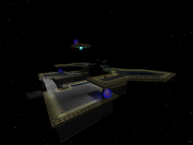
Not bad. The fact that it's symmetrical is a turnoff for any game mode except CTF or maybe regen.. But given this was a copy of someone's map this is more of a criticism to them than you. Wait, no it isn't. While this is a take on someone else's map, it is nevertheless your work and you could have changed it accordingly. So, point off for symmetry.
The jumppads are, I agree, of varyingly accurate powers and use. Some are right-on; you use them and you get to where you need to go. Others are too weak, and still others are too strong. The main one is the jumppad cluster in the middle (a jumppad cluster! great idea, why didn't I ever think of that..) so take a look at that. Basically the jumppads should not be useful only if you intentionally move in the direction of their force; they alone should push the player to the appropriate platform. This is because first off, each jumppad has a distinct direction in this map; only one actually pushes a player directly upward. Still all of them look the same and you can't tell by looking at the jumppad which direction you'll go in. So that's the first reason. The second reason is that players are more concerned about not getting shot (or in a map like this, not falling off the edges of the map) than which direction they should be moving in on a jumppad. I'm not even saying make the jumppads have an arrow on them, but maybe tilt them in the direction they launch into. You have that with a few but not all of them.
I don't have a problem with the texturing in the map. A wall texture as Win put it for the jumppad works here to be honest, and in a map as small as this using trim as the main texture on a wall isn't tragic. Maybe work on textures a bit more though.
Good work on the light edges of the paths too. They are slanted but go properly with the angles. They look genuine.
So.. Make this without symmetry if possible, and make the jumppads more logical. Even dust2 was a copy of a popular CS map, but the designer changed it up so it worked better for Sauer. You did change this map, as you said, by making it smaller, but there are other things you could have, or can still, improve.
PS, could you have put more rockets and shells in this? There's a fine line between a fast-paced game and a chaotic, no-strategy campfest. Improve the ammo distribution and HEAVILY cut rockets down.
3/5
