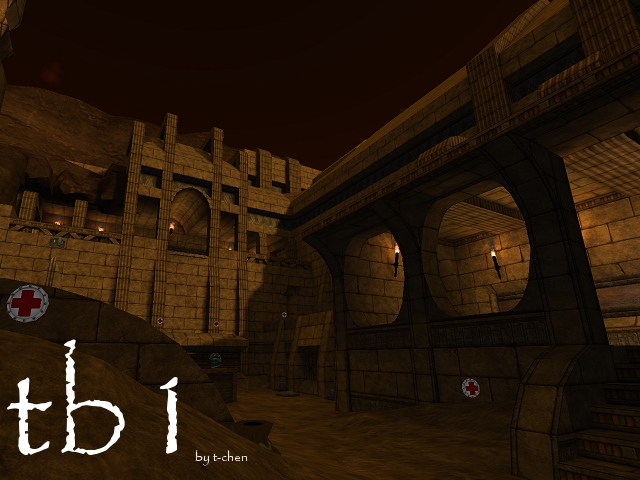
MUCH better than before. MUCH BETTER.
Here are a few problems I noticed:
-there's this one part where you can walk on a rooftop. There are shells on this platform. Nearby there's a hole you put in the wall that should be clipped.
-Also in this area there's a hole in the clipping so you can climb out and run along the 'pyramid' structure outside. I doubt this was intended.
These would be easier to show you if I knew how to put pictures in my posts (or links to them) but image hosting sites are a nuisance..
-You have a line of torches and they're all set in jagged looking blocks. If you don't know what I mean, they're in one corner and the healthboost is under them. The jagged blocks look like they were broken, not a design, and since they're all uniform it looks weird. I'd make them simpler. Also the particle used for the torches is a little big. Finally, you have so many of them it looks artificial. Maybe cut the number in that corner in half. Elsewhere the torches are fine.
-finally there's one corner that should be clipped. You clipped off this trim high up in the walls as the wall is pushed in there, but in one corner the wall curves and there's no clip. So a rocket jump can get you a sniping spot. It's over one of the teleporters.. I hate describing things.
The map is very rich-looking. When I first got in I was impressed. You had planks of wood, stray bricks, and broken floors everywhere and it was multi-layered and interesting. The strange architecture is more limited than the last which is good, but you kept some so it's interesting. The lighting makes the map very nice. It's sorta dim and gloomy, yet warm. I like that you did put motivation to get to the top levels while making it hard to get there. I'm not sure if a quad would be good there or not..
Anyways, my small details are important but I won't lower the mapscore.. 5/5
