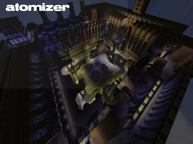
This is a good, solid map - the layout is (obviously) pretty basic, but you've managed to avoid being overly symmetrical so it doesn't look or feel boring. Should make for some nice 1on1s!
Personally I found a few texturing choices to be "not perfect" - I wouldn't know how to do it better though .. so I won't even mention them .. it's only in some details anyway, during a battle you'll never notice!!
Maybe the jumppads could use just a tad more power .. and I kept thinking I might want one or two more, to have quicker access to the other side .. but this is a serious decision (for "tactical" reasons) since now once you've spotted a player he can't just suddenly bounce over your head out of your gun-sights .. then again, you might want to do that yourself at times .. pro's 'n con's ..
Oh. BTW - you left a single cube in a top corner of your map (skybox-textured) .. you could (slightly) reduce your filesize by filling the entire air around your arena with such cubes!
The "arcades" to the one side (at the back of your screenshot) feel like one should be able to reach them from the y-armour .. maybe make the clip-material less of a "realism suprise" .. somehow visibly blocking access.
Last (and least!) you included two "Thumbs.db" files in your ZIP.
Rating this is a toughie - it's nearly 4 stars just from looking at it .. I'd test-play it with bots but you didn't include any waypoints .. maybe after some action on it I'd upgrade it to 4 .. but for now it's a 3-star map (but a seriously good one!) in my book. Don't feel bad though, I'm VERY stingy with stars!
