Packaging is important so that people know where to put the map and everything else. Upper-case to lower-case may not be a huge difference but basically being rigid about packaging etiquette prevents future nodes from being absolute messes.
As for this map.. Okay. I like the general theme of this map, but you are lacking a lot of fine details (which is a lot to say as you have so many small details...)
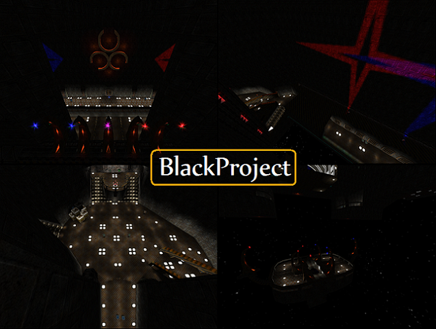
First off, the lighting is weird. You have those "stars" of light on the walls and while it's creative I don't know how useful it is. Basically, I question WHY those things are actually there while playing and it ruins the theme for me.
Also you're so concerned about using particles and lights to show the sides there's no subtlety. For example, on this one bridge you have blue particles and red ones, with purple in the middle (showing a transition). What you could have done is made the blue closest to the purple more red, and the red closest more blue, to make the transition less obvious. Right now it looks like a rainbow reject or something.
Interesting idea with the scrolling textures but you didn't need to bloat the packaging with textures that are already in the default packaging like cord1. To make an additional entry in the .cfg you can use the same "picture" twice or more. As for the custom ones you put in they're not that good or useful. I like the rusted metal one but it was applied improperly imo. You used it as a scrolling "liquid" texture and it doesn't look right for that. It's more solid looking.
I dislike the jumppad-teleport combo because it doesn't make sense; you could just use a teleport for its purpose.. But that's just my opinion. Falling down, then getting launched back up quickly, only to be sent to an entirely new spot where I freefall again, disorients me.
There are many dumb details you put in for no reason: Remember, simplicity speaks louder than many details.. Well, maybe not louder, but says something more important. You kept using that light texture on the floor as a pattern and it looks really weird.
The texture (basically one) used on the border walls is really basic. Diversify and use many textures so it's more interesting.
You have far too many colors clashing too. Some places have yellow, red, and blue all in one nauseatingly vivid spot. I imagine you made one side, copied it and reversed it, and then changed the lighting on the new side to the other one (blue to red, or red to blue) but forgot a few.. Actually forgot a lot.. Try to find those and work it out.
If you look up, everything is dark and of poor detail and it looks really strange. Maybe put lights up on there (SMALL ONES) just to make things pop out more.
You used yellow lights.. Why did you do that.. It clashes horribly. Plus there's no subtlety in them; you see this triangular patch of light on the ground that comes from this oddly constructed lamp on the wall and it looks.. bad.
And there's green light in one spot IT ALL CLASHES o_o
Finally, you subbed that lunaran grate texture for your own constructed one.. And right beside the texture it looks unauthentic. I'd remove them altogether.
So... You have good details but far too many and this map has only potential at this point; I look at it and it pops out immediately, but after 20 minutes of picking out details I make a list like this and decide it's horrible. That's something you should be doing; don't submit 3-day projects without first running through and fixing everything, deciding: Would I hate this after 20 minutes?
2/5 (good but far too many details ruin it.. 5/5 once you fix ALL of them)
