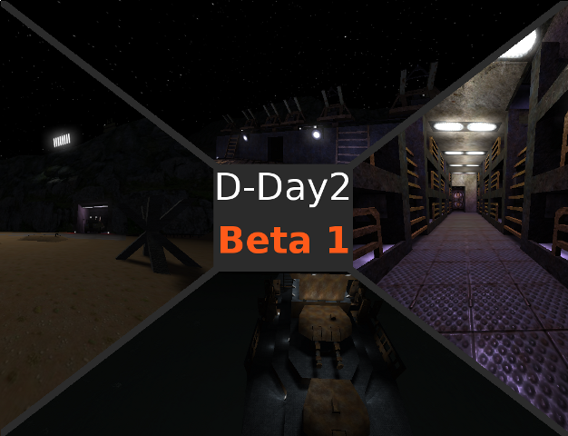
You map has lots of detail, but it is WAY to dark, I like the dark on most maps, but in this case I can't find my way around with out cranking my monitor brightness.
Some things I think you should try is adding a sunlight way up, and setting it to Red:20 Green:20 Blue:70, it gives you a nice nighttime look, not to bright either.
Also, your hallway lights may be nice with a slightly higher radius, If you don't want it over bright, take out every second or third one.
You Weapons sign in the hallway is also almost invisible.
Another thing to try is to play with spotlights, you could use them in your sub hanger, as the detail on the submarines is wasted when you can't see it. for spotlights, add a light with a considerably large radius, then /newent spotlight, there will be a line to show that its linked to the light you made.
Other than that, I love the map, lots of detail, lots of places to go, and lots of vent ( I love running around in vents )
The models of the submarines and the ship are just beautiful too.
Also, great idea with the first-aide on the wall.
I hope to see the next version.
