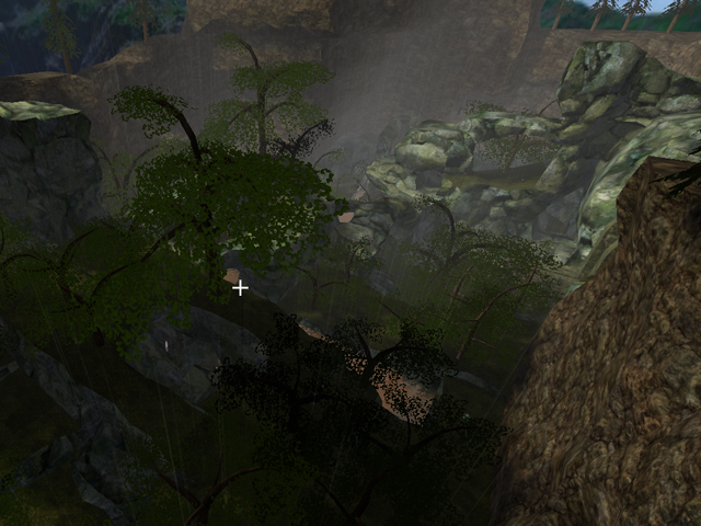
Personally, I didn't think you needed to change anything with paradiselost, and I kept the old one in my folder (renaming these files "paradiselost2" so I don't lose it.
Since you did, let me suggest a few things:
-the screenshot isn't a very good perspective of the map. The trees look artificial in this game, and since they're the focus of the shot, it looks really fake. The screenshot you had before (in the original paradiselost) was much better.
-there was a texture error in the first one, and it's still here: almost right beside where flag 1 is, the rock turns into grass. If you look on the side of the rock, there is that texture you get as a default in maps, the one that looks like a bunch of pebbles. I know you didn't intend that, so just pointing it out.
-I too am getting that glitch where a large portion of the map disappears, as if replaced by an invisible block. I'm not sure how to fix it, but it must be fixed.
-some parts look unfinished, for instance where you have a pond, this rock is at one end and it splits down the middle.. it looks like a hoof, and not natural landscape
-another example is on the rock-bridge nearby the camping spot at the top of the map (you know, where people rifle-jump up the man-made structure and then run along rock to where they can snipe). you didn't scroll enough on one block, so it sticks out.
Honestly this map is no longer hell. The fog's gone and the sky is brighter, and these were some things that made the map so gloomy and character before. I noticed the map's a lot lighter than your old one, and so.. it's not gloomy anymore :P
Compared to the Garden of Eden, yes, this map is hell but in human terms I'm going to be cheerful while playing and this disappoints me.
Above all, good work on the map. I don't see why you'd needed to change it before. The underground tunnels were quite fun, although confusing and time consuming. Ultimately you've removed one layer (underground) for another (bridges overhead).
4/5.
