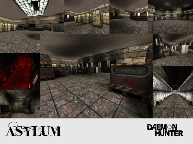
I really don't understand as to why a half-pig, half-machine requires institution...
This map is just a mess. The whole layout is small, but there's some areas which stick out (the health boost cell mostly). Also, you have two themes going on at the same time; Industrial and brick. The two do not mix; so next time just stick with one theme. Also, the broken glass in the lobby is horrible; the texture in the screenshot was better, but that one also sucks.
Other then that, the item placements suck, the lighting is okay, and the skybox is overused. There's a lot more detailed "space" skyboxes out there, but it also doesn't fit in with the overall style.
Some positive points is having some crates from Quake in it, the idea, and the use of rain.
You need to rethink your textures, and supply a little more detail into your future projects. Consider revising a little more.
