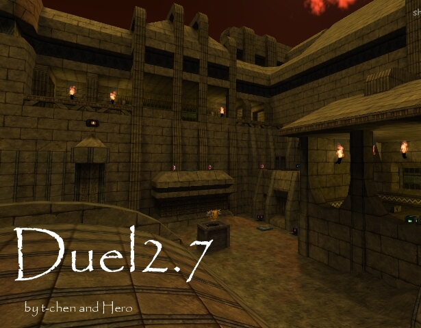
Fisch can you stop voting 5 stars on maps without commenting..
On to the map. The detail within this map was very simple. Wherever blocks were broken it was really obvious. There's a hole in the ground with huge rocks "broken" away. They're incredibly obvious. You could stand to make the hole a little less perfectly carved out, and include many small rocks.
Most of this map is accessed through rifle-jumping which is okay, I guess.. But it makes for a difficult game. Also, what is that thing in the middle that's shaped like an hour glass in a way? It makes no sense whatsoever.
You also bothered to put things on the walls. They're like pillars. They were done very simply as well and they don't look the best. They also don't perform a function but that's not as important where this is concerned.
Also, don't put your name/map title in the map where people can see it. It changes the map from an egyptian battleground to.. a map, made by t-chen, called finn. Or is that your name? Either way it kills the atmosphere. If you want to brand the map, put the brand where nobody is playing so anyone who goes into edit mode can see it.. Or type /mapmsg "Duel2.7 by t-chen/finn" .. That's a bit more professional.
Good job putting things on top. That adds a feeling of infinity to the map, like we're not actually stuck in a room running around.. There's actually more to this "world". Idk though, the architecture is kinda weird. Also the textureset is really overused but whatever.. Also the layout is kinda dull.
2/5, do I not recall a previous version being released? You're really not supposed to submit a new version as a separate release.
