Like with your other map I'll just comment on the looks.
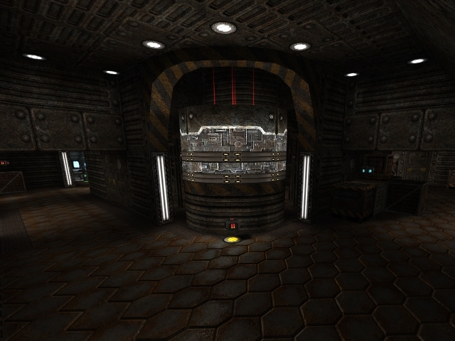
The textures seem a little random. I like the fact that you changed the glow on that light under every ammo. That's a creative indicator I've not seen yet. But texturing is off. For example, even look at your screenshot of that cylinder. On that thing you used 3-4 textures alone. You could simplify it and easily use 1-2. Right behind it is the quad. You put red particles adjacent to it, but the lights under it are green. That's not fitting there.
The lights you put everywhere lack light ents. I realise you put them there but then you put a 0 degree spotlight in front of them, so the lights don't actually do anything. Just put a light ent or two in front of the texture light so it will seem more realistic. This remains constant everywhere (even those colored ammo indicators).
Also, you have something like 4 different crates in this map, one of which is wood. I would replace the wood one with a more metallic one.
The part where you used two different mapmodel crates (one with the poison symbol) - I'd get rid of those. Also there's a light on the floor nearby that doesn't really fit considering you don't put lights on the floor anywhere really except there and there are other nearby lights on the wall.
Also you can put a small blue light in front of those computer textures for more realism.
I guess in general there are so many textures that they're either overused or underused.
OK the layout: Good. :)
3.5/5 again, sooo 3.
