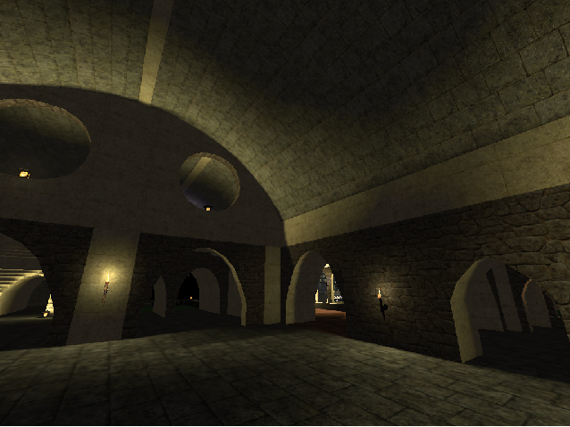
Did you have to include just the link? It could be downloaded here on quadro too right.. Not a huge deal but I hate waiting 40 seconds to download the thing off MegaUpload :P
First off: The water fountain/ bowl on the top needs more water lol. It's missing some at the edges so put that in.
Yeah I agree it's too big for gameplay so artistic is where it will stay. I managed 7 fps throughout unless I was in a room.
On that topic, one of the rooms has nothing in it. And it has texture issues.. It's the room near the water bowl that has no water.
The well on the bottom could be deeper. Also, the room near it has texture issues again. It's the one in the hallway where the hall turns.
The cross in the church has... Texture issues.
In the church I'd recommend changing the benches. Maybe make your own? These benches are designed for the park scene and they look dirty and cheap to fit this. That's good for outdoors but a church is pristine.
The texturing need a bit of work on that large pillar that leads up to the walkway where the waterbowl without the water is. It's one rock texture which looks okay where you lighted it but otherwise it's too basic in between the top and the lighting.
You put a lightsource under a wagon on the bottom level... This makes no sense. Lol
You should change the water so it's darker. Right now it's bright and doesn't match the nighttime scene you set up.
The part where you used the textures to say "Bar". You know, in the bar? You can probably use a smaller gridsize to make solid, more perfect lines as the letters. Using blocks for lettering is something that should stay in coopedits :P
In the bar there were texture problems on the bar part of the bar. Also, you could stand to put bottles and things on the bar. The barrels alone don't tell the story.
You used the red brick texture on the ceiling over the bar and throughout that building.. Consider changing that as it does not match.
The hole you put in the rock near the waterfall that has two teleports need to be more detailed and textured.
Also the teleports were so close I'm not sure which one I went to but the room I entered had a tonne of waterfalls and a water fountain. The waterfalls start from nowhere except a glass platform? What's that about?
The crosses in that room can stand to be more detailed. They're disproportionate to a real cross.
It's not logical that lamps would be so close to the waterfalls. Move them further away.
The rooftop's not complete. You tried making a triangular prism I see but never finished.
In fact the entire tower makes no sense. It's a series of staircases (not textured) and ladders (floating???) that just go around and around... To get to a small room at the top with nothing in it.. A walk that long needs a reward! Some eyecandy!
You get a good view up there though. One thing I saw was the cliffside with the glowing waterfall. It is very thin from that angle. Consider making the cliffside taller and thicker so it looks more of a natural rock than a thin wall.
The bottom part with the boats in the river (nice idea btw but make the boats more detailed. If you don't know, g + scroll reduces gridsize for better detail) has a bridge going across and mini waterfalls going through. It makes no sense for the water to fall through there though as no wall inhibits the water from running through. You either need to level the water out or make a wall to make the fall more logical.
OKAY so I've still not explored the whole thing but you're obviously not done. You even said you're not done so my question stands: Why'd you submit this? It's obviously an extremely good map (I didn't state what was good because that's kinda useless) but it's simply not done. The updates you need to add are going to take a very long time so ultimately you're going to need to re-submit this afterward.
Keep it up. This, once done, will be in the league of Skycastle. But if you're not careful it's going to end up a dreadfully incomplete-looking map with great detail in some parts, none in others.. Again, this is something that should be limited to coopedits.
Now.. My eyes hurt. Great job. It's not done though so.. Yeah I don't understand why you would submit it so prematurely, it's not like you have a few things to fix. You have ALOT.
Whatever. 3/5. Finish EVERYTHING and 5/5 easily.
