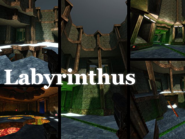
It's looking good and the beveled parts are a good idea too. Didn't playtest it yet, so i can't talk about the gameplay, but as far as i can say, there are no real flaws or things which really could be better...maybe just the double-rocket pickups which makes one a tad too powerful when collecting both of them.
Layout is a bit simple, just some rooms connected to each other, and it's kinda repetitive. Good that you used different light colours which then again are a bit intensive sometimes (very intensive blue, green etc).
Like i said, it looks good but on the other hand, it is nothing outstanding for my taste. Liked your "shindou" map a lot better, especially its composition of textures+lighting and layout. Though i really like your great ideas regarding architectural styles ! :D
So i give you a solid 3/5 with a slight tendency to a 4. (comparing this map with others of the same size) :)
