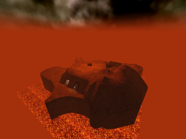
...like i said, i really like this idea. Your map has a good atmosphere, which makes it very interesting to "explore" and to look at.
And yes, try to build some more "mountains" around your map, you still can clip them if you want no one to get there...also, it would look way better if you made your rocks look more "rocky", if you understand what i mean ;)
Pretty good use of lighting here imo, it's not too much and not too few, just atmospheric. It would be awesome if this map would have some more of these hallways, maybe even some more and/or bigger "rooms" inside ? It's because i really see potential for this map ! :)
Good to see that there finally is a small map which is not simply an arena where you just run in circles...good idea.
If you encounter problems with the mapsize (regarding adding mountains or other stuff around it), try the command /mapenlarge, then later, you can simply copy and paste the whole map as it is now, and place it in the center of the bigger map then. When you've made your selection and see the selection box around it, hit the "enter" button on your right keypad, to also select all entities within the selection. Make sure you have a backup of your map in advance, if you make a mistake which cannot be reverted anymore.
So, i think this deserves a 3/5 already :)
