DaemonHunter | 2009-03-12 02:59
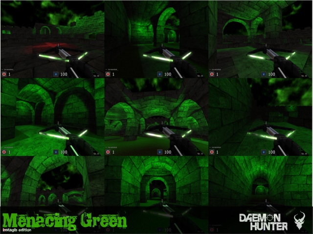
Menacing Green
A small castle-like map with menacing green lighting. (designed specifically for instagib/tactics arena)
A green evil castle, rather simple, but provides exciting gameplay.
Final Release. Designed specifically as an instagib/tactics arena map. [version 4.2]
More intricate details in the .txt readme file concerning lighting and other basic stuff.
Also, please check out the new theme here:
http://www.quadropolis.us/node/1906
Enjoy,
DaemonHunter
menacing-green-v4.2.zip (759.74 KB)
login to post comments
