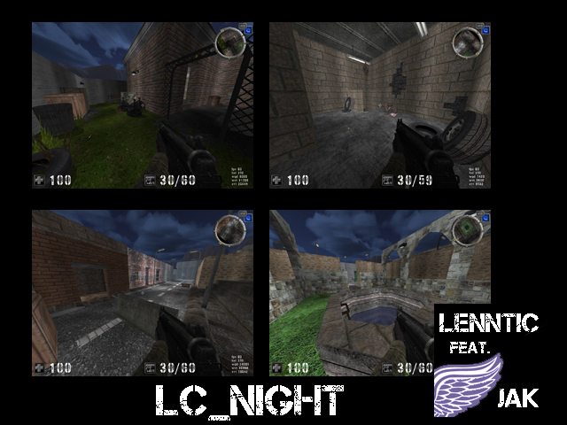
This map isn´t that bad. It really looks like you guys put some effort into it, but there are several weird things going on...
Please have a closer look at your broken walls. There´s one built of red bricks for example and every site of the bits are differently textured. That doesn´t make no sense. I found this mismatching style all over the map and I started assuming you like it that way.
However, it doesn´t look good, neither realistic and I´d even say it makes the map feel messed up. I remember one door is cut off at half height and you can see the very bottom of the door-texture on the upper end... You may always keep the texture-align in mind while mapping. That´s a no-no for sure!
There are a lot of strange corridors, some are too cramped, some are kind of useless and don´t fit the scene at all. It has an overall inconsistent feeling, to be honest.
Well, I highly suggest reading the mappers-readme again, because there are some useful hints and notes about layout and map attributes. You also may try to draw little layout scatches before you start mapping next time.
As I said, its a nice attempt, but still off average quality, in my opinion. Keep it up!
