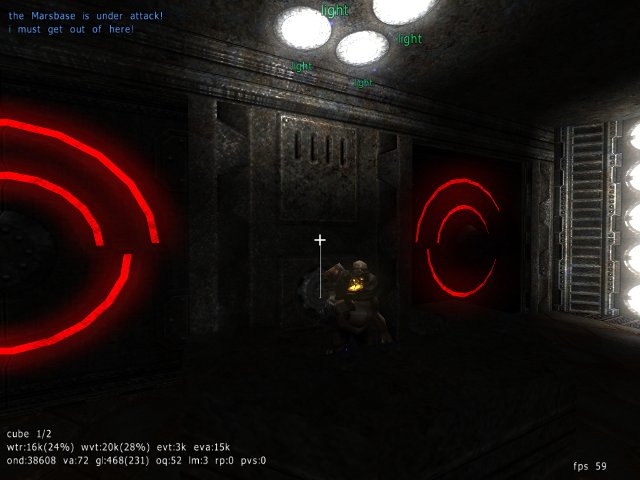
We really don't get many SP maps .. so it's always good when a new one turns up;
this one isn't all that challenging really, but it's nicely done - the gradual build up of enemies combined with the parallel accesibility to new and more powerful weapons is superb.
The geometry is kinda "okay" in my book - the ceiling's too low for my taste, but that's not any real issue during the fighting .. but (as I mentioned elsewhere) I prefer to be able to jump-n-dance around enemies.
Some bits feel like they could've done with some more work, but nothing "exceptionally ugly" - just parts where the cubic nature of our octree universes is too obvious; bits where the dimensions seem more calculated than realistic .. where you've left exactly enough space to put in something you wanted there, but the bits don't fit seamlessly, they're just stuck onto each other. There's a room with a stairs inside a tiny stairwell (only one cube gridsize 3 deep), there's that duct-tunnel-thing to crawl through IIRC there too .. that room felt done without too much care the most.
Also I'm not too sure about all those doors you've put in, especially the aspect of them closing on you while you're inside their trigger-zone is annoying in this map much too often! Either make more of them open-once or loose some entirely - or make the area to fight monsters in take you further away from them so when they close and you approach them again they register that .. instead of them closing directly in front of you.
Looking forward to Part 2 .. which the "Part 1" bit somehow implies to me ;-)
Please fix your packaging though! Read the packaging guide! Use ZIP!! Put your map in packages/base!
Another thing would be to fix up your screenshot/mapshot (which are the same ATM) - you might want to use Pretty Screenshot for that actually.
