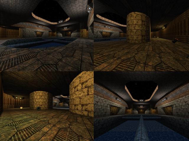
Ain´t bad, simple and clean layout. You´re heading the right direction.
It´s weird though that the water is clipped imho. Where the tubes meet would be a great place for the healthboost or YA, if you were able to risk falling down.
Detailing is sparse, but evenly distributed (which is good).
The weakest point is the texturing.
The trim textures on the bounding walls don´t work too well, since they become repetitive very fast. Trim textures should be used to trim, not to cover large areas repeatively.
If you had chosen rims of 4 cubes height for the lower and upper section, and a wall texture inbetween, this could have been avoided.
Also the floor uses only one texture, and it´s not a very good choice for a floor.
I see you found some textures you prefer and found to work good together, but try to experiment more. It´s a tedious task at first, but you´ll soon find "your" textures.
Also a little more detailing to make the walls less flat in appearance (be it by texturing or geometry) would help.
To sum up, just a little too consistent overall (only imho maybe). Try to find ways to break up the monotony and have a bit of individual detail here and there, while keeping a consistent "detail density" so to say.
By starting out simple, you´re on the right track though.
Just keep on mapping :)
