viruz | 2009-02-05 19:02
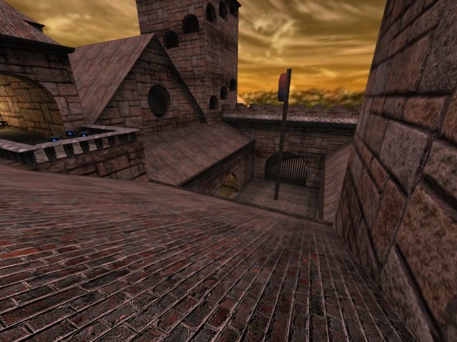
cwcastle
Cube 2 (Sauerbraten) | Release | Stable | Deathmatch | Capture | Medium (5-8) | Creative Commons (BY-NC)
A small castle - caputremap
A small capture-map with 5 bases.
There are much items around, yellow armour can be reached with a rifle-jump in the shop.
map made by }TC{viruz and }TC{hero
packages.zip (1.75 MB)
login to post comments
