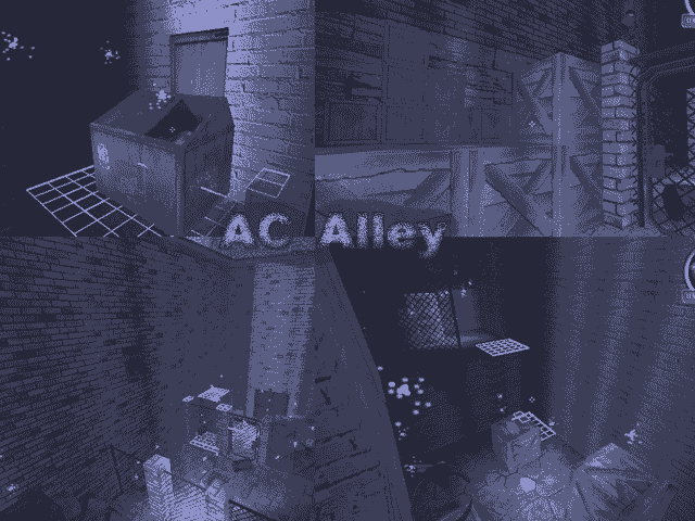
Lets have a look at the layout: There are two areas connected by two narrow short corridors. You need to jump up on crates to enter those ways. That´s rather a training map then a map to play on. I haven´t played it online, but I´m quite sure that the gameplay is not much of a fun, though. The idea/theme is good, but both areas could be bigger. Here´s a little scetch how I would have made the layout:
Its a Concept Map, and online the spawns are near the windows, It makes the gameplay exciting because people are Trying to rush to the windows, also the layout was originally have the main area closed but People got bored since the gun fight is in the other room.
Another strange thing is the lack of pickups. There´re actually none. Did that happen accidently or in purpose? There should be at least ammoboxes.
This is first done on purpose because people are INSTANTLY killed by someone else, which took out the need for ammoboxes, but I added them on my newer version.
There are some details and it looks like you seriously tried to implement former suggestions. You´re on the right track, so to say, but you need to keep an eye on the gameplay. I hope that scetch explains what I am suggestion.
Thanks, also the layout again makes it fast paced and make every weapon usuable.
