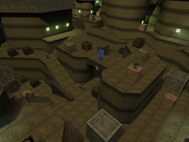
I actually love this map. it needs some work though, and I'll tell you what needs improvement before I tell you what I like:
-the lighting is bad. where you used saturated green it is really fierce and makes what I call a "lime" effect.. Where the color is really extreme and looks unnatural. tone it down a bit and that will fix it.
-the boxes are cool, and in some cases they allow for fast access to higher levels by jumping off them. however, you should change the texture of the metal ones to match the wood ones. they do not fit in at all. also, remove a few in the narrower areas because they do mess up movement. finally, the big ones look retarded.. lol instead, make stacks of the small ones.
-i think the clip on top of the towers is a bad idea, i'm not sure if I'm the only one but w/e. I think it would add to the gameplay to be able to rifle-jump onto the top and run around. the outskirts of the map should remain clipped though.
Now, for what I love:
-the layout is really good. It's fast to get around and yet someone can't really just camp in one spot and see the other guy across the map because there's so much in the way of view.
-there are multiple levels but they can be easily accessed through riflejumping without looking for ramps, etc.
-the texture (really there's just one lol) fits, and I like it. you could do more with it though.
I'm actually going to play on this with my friend. It's that good. And I hope you improve it. If not, I'll do it to the standards I mentioned and just play it with my friend :P
4 stars. do what I suggested and easily a 5 star.
