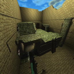
Yeah I loved my jumppad even though it doesn't completely match my theme.
What parts in particular could use more detail? Well perhaps you can better SHOW me than TELL.
Where's the "bug" cube? | honestly don't know what that is lol.
The lighting is pretty bad I guess, especially on the bottom level. I'm still not the greatest at lighting. Should I be using many short-radius lights or one large-radius light in the lower levels? On the top I thought the lighting was fine.
This was my first map that honestly didn't need a .cfg file. The sky would've remained the same, as did the textures. The only major thing I edited was watercolour but that remains imbedded in the map to my knowledge.
EDIT: OH I know what you're talking about when you said bug cube. You meant the one that you can go up into but it's solid going down. I love it, I didn't even make it because I don't know how. I found it on a coopedit like a month ago and saved it because it could be useful (in fact I saved the map as "useful" Lol)
K good critique I'll work on the lighting if possible. I've never done it properly so even my edits won't be effective without guidance. W/E I'll try and save under diff name.
ALSO my overall rating is lower than 4. If you guys vote can you please add your opinions so I can work on it?
