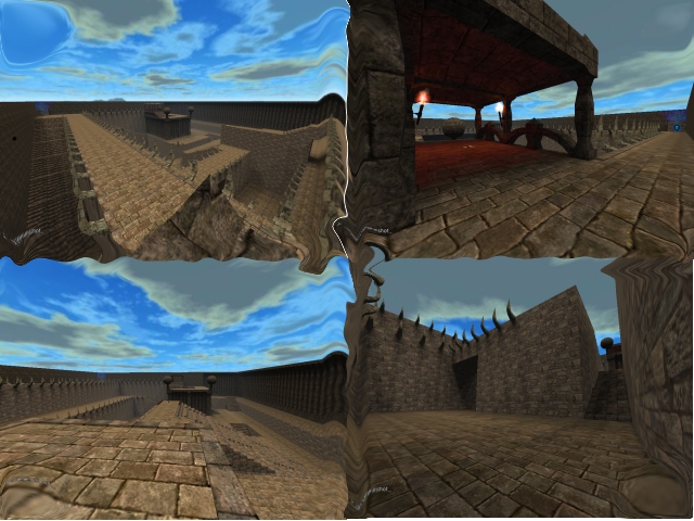
H'okay, review times now. Your map has definite potential- I like most of what I see. But it could use a lot of polishing. I'm inclined to say your map has a bit too much height, it feels like you have to run up way too many stairs to get up to the next level. Unless I'm completely wrong, most people are going to end up in the tunnels and stay down there, because getting out will leave them too exposed for too long.
Speaking of the tunnels, they're pretty bare. You need to try and make your level of detail more even: some areas have a lot of detail, while others are basically Legos. I'd add lots of extra geometry to the tunnels and try and fit in several more textures as well.
Your lighting could use some help too. You're a bit lack in sources (couple of torches, teleports, and the sun), so it'll take some prep work to set up, but this map could look much cooler with some dramatic lighting.
Speaking of teleports, one of your teledests points the wrong way.
Finally, think about adding a cfg that sets a different skybox and a thumbnail for your map. Be sure to package them right (files go in the /packages/base folder), and good luck!
