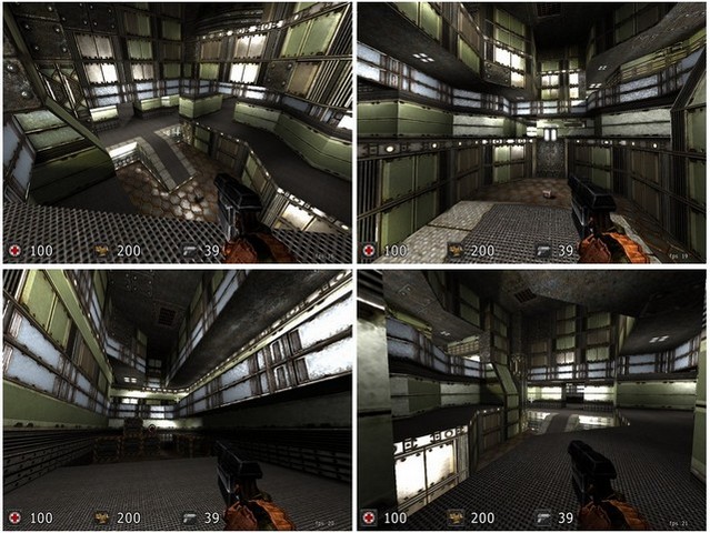
I like the map itself, it looks solid. A few complaints about jumppad positioning, but that's very minor.
Lighting could be a bit more sophisticated, right now it's kind of a fullbright map. The map could be strengthened by making some of the corridors a bit dimmer etc. In the same vein, the texturing is ok, but a whole map of it is kinda straining. I'm impressed that you managed to make it look as good as you did though, I don't see those images being used very often.
The really fascinating thing about your map though is the way it was obviously constructed. I've very rarely seen such a classic use of additive design. When I flew outside the map (or tried to, at least), I was amazed by the complex jumble of geometry staring back at me. It really kind of blew me away. So, as an experiment, I went through and "un-additived" your map, so that only the player-visible polys remained (excluding your out-of-map signature) and then ran it through. The map was lots more efficient, and much easier to exxamine, but the resulting change in filesize was very small (about 3 kb less). If you want the ogz I can email it to you, it's very interesting comparing the two.
---
BTW, your packaging is a bit off. You don't need to include the screenshot (though it's not adding much, so ok), but the thumbnail needs to be in the /base directory, not the root directory.
