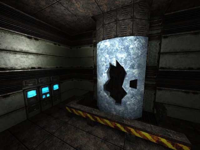
Not bad for a quick run through. Is this one of your first sp maps? You've got some good ideas and traps.
My suggestions are:
1. Make the rooms and halls a little bigger. It's a bit tight for a "fun fire fight" with the monsters.
2. Add some detail to the rooms, it's a bit "plain looking". Some curved geometry and better contrasting lights can go a long way.
3. Normal texture maps would be nice. The engine offers some great eye candy.
If this is some of your early works in sp mapping, you've got a good start. Add some "detailed eye candy" and those cool ides you have will shine.
Again-good job for an entry level mapper.
MitaMAN
