shadow | 2008-03-27 19:24
*
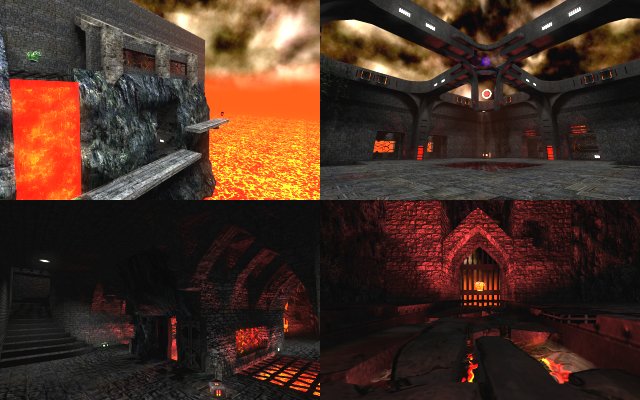
Hand of God II Cube 2 (Sauerbraten) | Included | Final Release | Deathmatch | Medium (5-8) | Creative Commons (BY-NC)
This content is now included in the official release of the game, so you do not need to download it if you already have the latest release. The content stored here may not reflect the copy the game uses.
*
*
Starred Content
Hand of God II
- Put the map files in packages/base
- Download the evil_textures zip, and extract to packages/evil_textures if you don't already have my custom normals for them (you probably don't)
- Shoot stuff
hand of god 2.zip (931.36 KB)
| Attachment | Size |
|---|---|
| evil_textures.zip | 454.34 KB |
login to post comments
