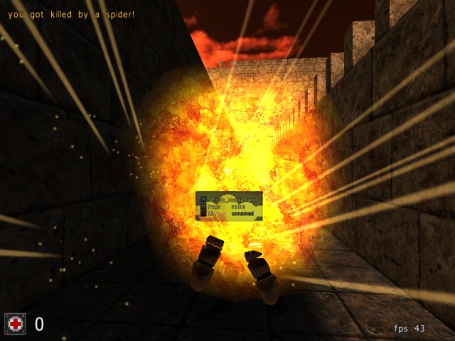
nicely grouped monsters .. I liked the way you kept them coming at you;
of course, with this map layout you couldn't have gone any other way about it, really ;-)
But it really is very well done - from the challenge point-of-view,
maybe some tweaking regarding placement of (especially the health) items might be in order though,
it's very hard to sometimes avoid a health-pickup even though I'm only at 95 .. so I'd rather wait another 10-15 hitpoints till picking a +25 health pack, ... - ... well .. they're slap-bang in the middle of some pretty important stairs .. maybe that was your evil plan though?!?
Regarding geometry I think you're aware that it's very blocky - but that's something you usually won't mind in the heat of such battles as you will fight on this map ... heh - but still, you could put some more effort into making some nice eye-candy, just to round it all off ;-)
Oh - and a little tip - that whole area "outside" of the playing field - make that into fully filled cubes and simply place skybox texture on all the cubes facing into the playing field ... go as narrow as you can be sure nobody will rocket-jump into the "ceiling" ... this optimizes the octree usage-ratio :-)
Keep it up .. what with all these lil' SP maps cropping up now-and-again, and now even a new one announced to hit us soon by MitaMan himself ... gotta do some mapping myself again in that regard!
