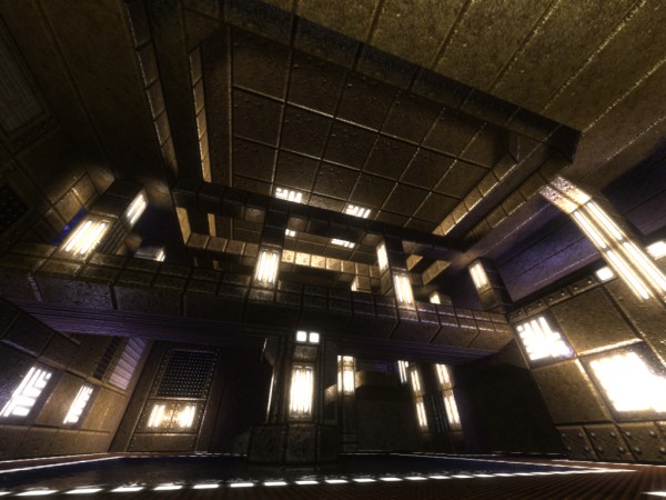
Nice map. I like the texturing, but some of the ramps could use better texture transitions (I'm guilty of this too), especially where it goes from blue bumpy to red bumpy stuff. Also, your "golden triangle" is really small (yellowarmour, healthboost, quaddamage), and doesn't cover much of the map.
I don't really understand why the greenarmour and yellowarmour are so close to each other, either. It makes it much too easy to gather up both armors, the healthboost, and the quaddamage before anyone can get to you. Each is placed nicely by itself, but the three are too close together.
One thing that bugged me about this map is all the water. We're on a desert planet, and there's water just sitting around being wasted? It looks good, but doesn't make much sense.
Overall, nice work. Good detailing, texturing, lighting. 3/5. Change the golden triangle problem and that'll bump up to at least a 4. :)
Oh, and you've got some packaging quirks to work out. Check out node 226 to see what you should change. :)
