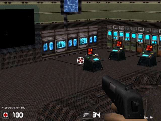
your style of texturing is a bit weird. Basically, you had some good ideas, but putting all those textures together doesn't really work, all the time.
For example, there is one room with all these trees and plants, inside a cave-like textured room in a spaceship ? Or the middle-age beds or the fireside, made of bricks ? Good idea about the orange-coloured particles inside the chimney, though.
I guess this map would work better for single- than multiplayer, most rooms are too narrow. These computer consoles for example make it hard to navigate around them, they have a big bounding box which feels like clipped off. How about trying to build such things by yourself, there are so many useful textures for that stuff ;)
Also, some rooms are lit up by too many lights with high radius, which destroy the atmosphere because there are no visible shadows anymore.
And remember: an almost empty room which makes it possible to move in it easily is better than a fully-detailed room with a lot of stuff, which makes that room too narrow to play inside. So, less stuff and more gameplay.
Nice atmosphere in your map, though.
2/5
