hey! You asked me to give you a short review and here is it.
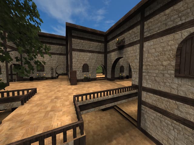
textures: Nice use of textures in general
geometry: A good start but I think it could use some variety. it looks a bit too blank and uninspired
details: Maybe put some effort in some more details as well
layout: I didnt playtest it yet but I think some ways are not as useful than others. Also it looks often very the same. Try to make different corridors and vary with the size of the mapparts
Overall a decent map. Maybe you could put some more effort into details and geometry. You used many 90 degree angles which makes the map look like a bit half-hearted. maybe you could put some more effort into the layout as well. obviously you have talent in doing some good ctf-layout which you already proved with stadium. In the end its still one of the better ctf layouts I have seen so far.
GJ
Gangler
